
You may have noticed that after five years, ConvertingCopy.com finally got a new makeover. Years ago, when I purchased the Flowhub theme which we’ve grown accustomed, I put a good bit of time into making tweaks here and there to get it how I wanted it, experiencing a lot of headaches along the way. More or less I was happy with it, but the fact that it didn’t come with very much designer support and hasn’t been updated in some time, it finally exceeded its use this year when Google announced a major change to their algorithm regarding website mobile device friendliness. This begs the question, is your website mobile ready?
Is Your Website Mobile Ready
The writing’s been on the wall for years now. Mobile device use is no longer simply a rising trend but is becoming the norm, particularly when it comes to browsing the internet. As you can see from this infographic courtesy of comScore, in early 2014, mobile device use for browsing the internet surpassed desktop use globally and that disparity has only been growing and will continue to grow and divide as more and more people switch over to mobile device use in place of desktop computers.
What this means for you as a webmaster is that your website had better be mobile ready, meaning that it employs a responsive design and therefore can be displayed on a range of different devices and screen sizes without issue. The code within a responsive site accounts for the dimensions of the device which it’s being displayed on, and will resize itself accordingly and flawlessly. If it’s not mobile friendly, you risk not just annoying your website’s visitors, but perhaps more importantly Google itself.
As always, Google wants to deliver the best search results to its users who choose it to find what they’re looking for on the web. Therefore it stands to reason that Google doesn’t want websites which look buggy, bulky, or just plain screwed up on mobile devices, particularly when that’s the norm. Google has confirmed this by rolling out a new algorithmic update on April 21st which will reward mobile ready sites with better rankings.
And yes, by the same token, sites which are not mobile friendly will conversely drop in the SERPs. So all things otherwise being equal between two sites, the mobile friendly one will rank higher. Fortunately, the fix is (relatively) easy.
How to Make Your Website Mobile Ready
First, keep in mind that your site may very well already be responsive to mobile/all devices. Find out by entering your site’s URL at https://www.google.com/webmasters/tools/mobile-friendly/.
This test will identify any problems your site has which maybe inhibiting its mobile readiness. If the test comes back with some issues, you’ll have to fix them to ensure that your site is mobile friendly.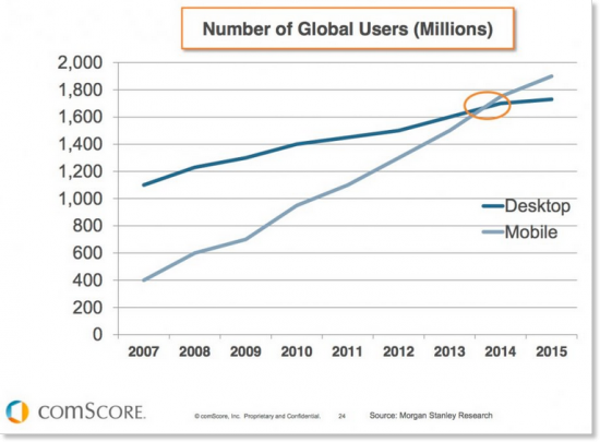
Some typical issues it will come back with could be:
Text Too Small to Read
Mobile Viewport Not Set
Links Too Close Together
Content Wider Than Screen
Uses Incompatible Plugins
While these all SOUND self explanatory, most of them aren’t nearly as straightforward as they sound and seemingly obvious fixes such as spreading out your links in your content won’t change a thing.
Unless you’re an experienced coder, which I’m going to assume that you’re not as you likely would have been on top of this months or years ago, your best bet is to make sure that your versions of WordPress as well as your theme itself are up to date.
Typically the problem is in your theme itself. If you simply have an outdated theme, check to see if there are any updates available for it as it’s possible the developer has since put out a newer, mobile friendly version of your theme for download. If the theme has long been abandoned by its developer, then your best bet is to switch your theme to something new. Just make sure you look for a theme which is listed as being “responsive” or “mobile ready” when you update. There are tons of free ones out there, so start browsing and find one that works for your niche.
After you make the switch to a responsive theme, retest your website’s URL in the Google webmasters tool. For the vast majority of issues which will appear if you failed the first time, they’ll all be fixed with a new, responsive theme (including the curious “uses incompatible plugins”).
This is also just a good reminder that you should be using themes which are routinely updated and developed to keep your site secure and both user and search engine friendly.
That’s basically it; once you update your site to be mobile friendly, you can rest easy knowing that your site will be rewarded with better rankings after the update and that your site’s visitors will have a great experience no matter what device they’re viewing it on. At the same time you can also smile knowing that your competitors who haven’t updated their sites will be vacating their first page rankings, as well.